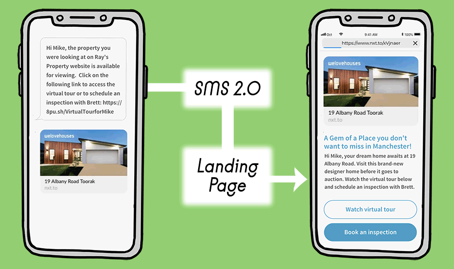
Guiding your clients to a mobile landing page must become one of your main goals in your marketing efforts.
Imagine you have crafted an amazing message for your mobile SMS marketing campaign, and you decide to include a link to your website. Your contact list clicks on the link and gets lost in the heap of information your home page has. What were they going to see in the first place?
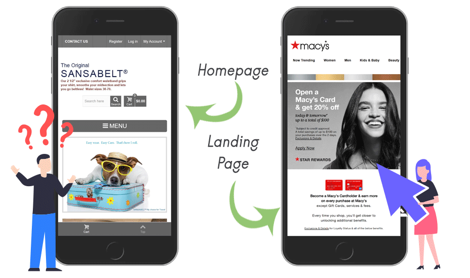
Now, the same situation, but you lead your contacts towards a dedicated mobile landing page.
Which is a website that resonates with your initial SMS message and guides your mobile visitors towards the path to become your customers.
In this guide we will show you step by step how to craft the perfect marketing strategy using both SMS and your custom-made mobile landing page, and the landing page best practices to succeed. It cannot be easier than a little planning and using the tools Octopush includes for all our customers!
Why create a mobile landing page for your SMS campaigns?
Every company is advised to hold an Internet presence, the website is the storefront of all kinds of online businesses. You may already have a website, but not all the information it shows it’s important for your clients all the time.
A mobile landing page is, simply said, a page where the user arrives from a specific link. Under this general concept, any page in a website could be considered a landing page, however, the meaning is more subtle than that.
Mobile landing pages are a very important part of any online store. In the present day, landing pages are looked at as an essential component to create and promote your own brand.
TL; DR, landing pages help visitors to follow the path you established, and to perform the action you expect from them.
The elements of a successful mobile landing page for your eCommerce
Perhaps you are now convinced of the importance of creating mobile landing pages for your SMS marketing mobile campaigns, but you are wary thinking the task would require money and effort. With the SMS 2.0 integrated website builder Octopush offers, you don’t need to be an expert to craft your own mobile landing pages.
What matters the most is following these simple mobile landing page best practices and guidelines to succeed in every of your marketing SMS campaigns.
1) A clear call-to-action message
What do you want your visitors to do on your mobile landing page?
A clear call-to-action is the imperative message you give to the reader. The mobile landing page should include a clear call-to-action that focuses on one goal and strictly communicates what the mobile landing page is about.
A mobile landing page with a clear CTAs should include a single action such as:
- Buy now button ←You want your visitors to become customers
- Call button ← You add a call button when you need feedback or you want your customer to make an appointment
- Login or subscribe ← You have a newsletter, or visitors must subscribe to have access to your service
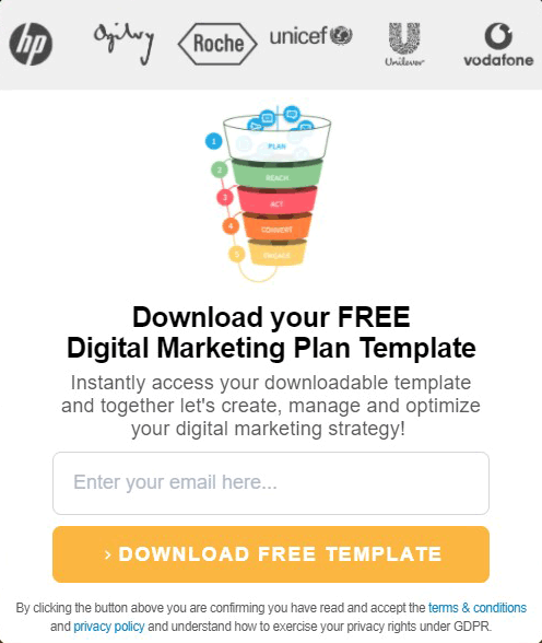
- Fill out the form ← You are performing a survey, gathering leads or feedback
- Leave a review ← You need feedback from previous customers
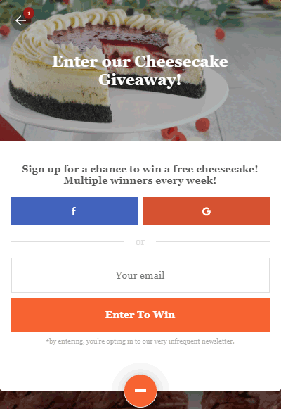
Most CTA’s come in the form of a button, but marketing mobile nowadays proposes innovative variations.
For example, you can even create mobile landing pages using nothing but images. Or you can lead your prospects to an online catalogue, to download an app, to test a game, to participate in a contest, send an image, a seamless click to call button and more.
2) A unique value proposition
A value proposition is a way to show people your store has something that makes it different from other businesses. It must have the right message that will appeal to your customer.
Examples of unique value proposition:
Your competitors sell dog beds, but your dog beds are made of 100% recycled materials. Be sure to include such information in your mobile landing page in a way to appeal sentiment in mobile users:
Introducing our new PetCare line of dog beds 100% made of recycled materials! With your purchase, you contribute to reducing world pollution. More info: https://8pu.sh.com/dogbed
You have a massage service downtown. You have created a fidelity program for your customers to return. Sent a message to your former customers leading to a mobile landing page with a subscription:
We are giving free fidelity cards to our most valuable clients. Fill out the form and you’ll receive one printed card in your next visit. https://8pu.sh.com/fidelity
You cater appetizers for gala parties. You have the largest selection of appetizers available in your catalogue. Your value proposition for your visitors goes in the line of:
At La Bouffe you can browse and select among the 150 different appetizers in our catalogue. Or create your own custom package for your event! https://8pu.sh.com/catalogue
If you are selling a solution for a problem that your clients haven’t even considered as a problem yet, spark their curiosity first, and educate them later.
Tired of losing socks in the laundry? We have the solution right here: https://8pu.sh.com/clean
Does your cat fall asleep way too much? Make a test that reveals much about your pet https://8pu.sh.com/cat
Are you getting many customers from an unusual kind of audience? Check a quick guide of how to target the right audience. https://8pu.sh.com/insights
Research your competitors, they are most likely striving to rank in the market too. Your offer must have a unique highlight above them. Sometimes it’s not a matter of price or quality, what leads to winning clients. It is important to take into account reasons such as availability of your products above the others, or whether your brand resonates with the customers.
Lastly, you will need mobile landing pages that are tailored to suit specific groups of customers. This way you will maximize the number of people who visit your mobile landing page and complete an action on it.
3) Make your mobile landing page visually appealing
It is essential to provide the buyer with visual variety. Appearance in mobile devices is smaller and there is less available space. If it’s not possible to showcase your products or services, then take photographs of similar value and use those images.
- Include good quality images, those should be mobile optimized.
- Use different typographies and font colours. But don’t overdo it, two is the right number of typographies, and three is a wise number for colour variations.
- Use bullet points.
- Include white space. However, as the mobile devices screen is smaller, keep the use of white space scant.
- Showcase brand labels or customer satisfaction ratings in different visual blocks.
- Use blocks of different colours to distribute the page layout for mobile devices.
You have to respect the visual identity of your company. The image of your brand has to resonate with the message in your SMS and also to match with the mobile landing page design. In such a way it will reassure your visitors your communications are official and not part of a scam.
The mobile landing page font colour should be bold enough to attract attention, but not too bright or highlighted too much, so it tends to diverge away from the mobile landing page design.
For example, a red landing page call button placed on a red landing page background, it will result in no conversions, since there is nothing for the user to click.
Below are three examples: The online store of Rover P6 Cars, which is actually mobile friendly, compared to ShirtMAX and INGLOT.
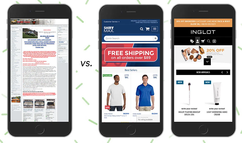
Don’t forget to include captions that describe how your product is beneficial to buyers!
4) A message-match
Message match is a concept you will find more often in online advertising, but it fits right while linking your SMS message with your landing page. In simple words, it means: “show what you promised.”
The headline is the title for your landing page. It tells your visitors what is inside and it should go top of the page. Give visitors exactly what they are looking for, by showcasing the solution to their problem from the get go in the headline.
This is the moment you will have to think carefully how to convince mobile visitors in a few words.
Examples of succinct headlines for a mobile landing page could be:
- 10 living room idea designs that cost less than $100
- How to choose the most effective outfit for a first date
- 101 landing page design secrets that will increase your conversion rates
- Choose your dream holiday package and win an extra weekend for free!

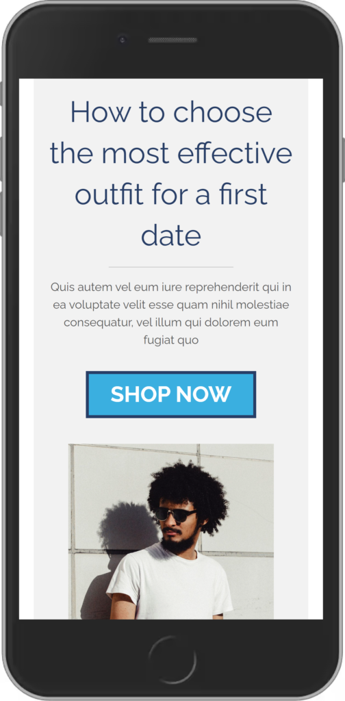
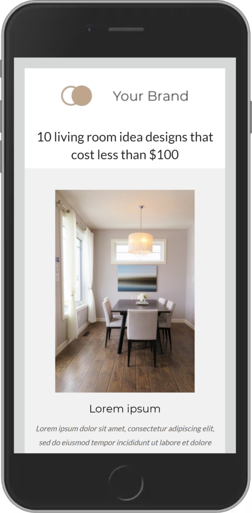
For your mobile landing page to be successful, it needs to be designed to convert. Think of the headline like the hook and the subheadings as the reel.
It is important to list the benefits of a product and not only its features because customers are more likely to be persuaded by problems that they can easily relate to and solutions that solve problems.
If you are announcing a completely new-in-the-market product, start with a short story that will make mobile visitors relate to the problem and to keep scrolling down on their mobile device to find out what your offer is.
Each headline must be provoking and encourage visitors to keep scrolling down to the offer or your call-to-action.
5) Incorporating social proof
Customers might need social proof for a number of reasons, including as a measure of credibility or to view customer endorsements.
It is important that the mobile landing page has testimonials and reviews that are recent and from diverse sources such as the company website, other websites, and social media. Customers can also get social proof just by reading the comments posted on landing pages.
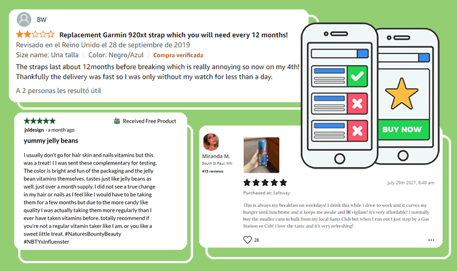
You can support your product with social proof in your mobile landing pages, by building social media shares, including a section with testimonials, or including reviews.
What are the advantages of using the Octopush SMS 2.0 service?
Now that you have read these landing page best practices, perhaps you are convinced of using them to enhance your marketing campaigns. And you have added a link to your SMS messages as a part of the call to action.
However, SMS relies on the brevity of the texts, and URLs have a tendency of being too long. A solution for this problem is to rely on an URL shortener service, but it requires creating an account and, most often than not, creating several URLs is limited to the premium package.
Thanks to SMS 2.0, Octopush proposes the creation of mobile landing pages designs for your SMS advertisement campaigns, and on top of it, the tool allows you to add a custom shortened link in the body of your SMS message.
SMS 2.0, personalizing the buying experience for your customers
- There is no limit in the number of mobile landing pages you can create.
- You can do as many modifications to the landing pages as you consider necessary.
- A wide variety of mobile landing page examples and templates available from our provider Unlayer.
- Drag and drop platform, no need of knowing how to code.
- Great for businesses that don’t own a website, or want an extra boost with page speed.
- Customisable URL shortener and tracking tools
Lead your contacts from an SMS to your mobile landing page
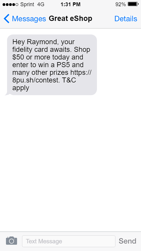
Step 1: Create an attractive SMS
Pay careful attention to the message in the body of the text you deliver via SMS, this call to action must lead the user to click on the shortened link and nothing else. Consider it the door that leads your prospects and clients towards your conversion goal.
What tracking metrics to look for in this stage?
SMS delivery rate and blacklisted numbers
What does it mean?
A high delivery rate shows your contact list is updated and there are no obsolete or inactive numbers in your database. The fewer blacklisted numbers, the most responsive is your audience to your promotional message.
Step 2: Your contact clicks on your link
Now that the user has shown interest in your SMS and felt compelled to click on your link, they give you another chance to convince them further. Don’t disappoint them!
Once the user arrives to your mobile landing page, it becomes vital that the call to action attracts the short attention of your prospect clients and invites them to convert right away without a second thought. Think about the actions you want your clients to perform and, in the way, to talk to them to convince them to do them.
What tracking metrics to look for in this stage?
Clicks.
What does it mean?
A high click through rate means your text message is enticing and your audience is open to hear from you.
Step 3: Your contact read your offer in the mobile landing page
Consider that the lead may have a problem, but if the solution you are proposing results more cumbersome for them, they will back away. One of the most prominent ways to avoid this is by a reward system. From reading your SMS, the user already expects an added value to the benefits you have listed for them.
What tracking metrics to look for in this stage?
Number of unique Visits of the landing page.
What does it mean?
This metric gives you accurate information about the times your contacts see your landing page. You can use this information to trim further campaigns to a high opening hour.
Step 4: Your customer reacts according your goals
Here it is important to recall the goal of your marketing SMS campaign: to get leads, to gather information, to invite to make an appointment, among others.
And to craft an offer accordingly: an advantage, a discount, a promotion, a trial, a product, etc. and the mobile landing page must have the same intention.
Mobile landing page examples:
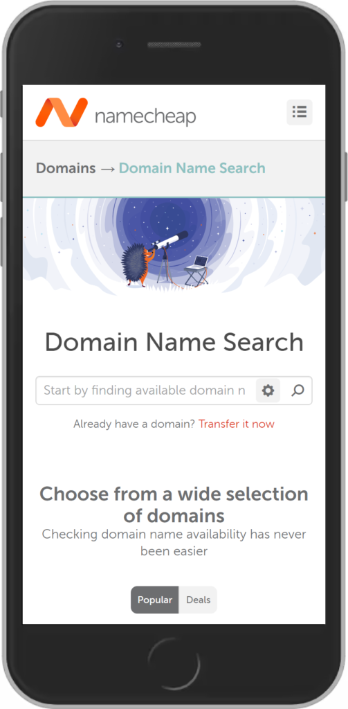
Namecheap mobile landing page.
Promises: Find cheap domains.
Delivers: Field asking you to enter the domain name you want for availability. Scrolling down sends you to a list of available domain extensions and their prices.
What tracking marketing mobile metrics to look out in this stage?
Clicks on your landing page’s CTA, fill out forms, customer feedback, purchases
What does it mean?
Depending on what you have for goal for on mobile landing page. You can customise different goals for your SMS marketing campaigns. Most often is purchases or the number of mobile users applying a promo code.
How to start using Octopush SMS 2.0 to build a mobile landing page
To activate the SMS 2.0 feature:
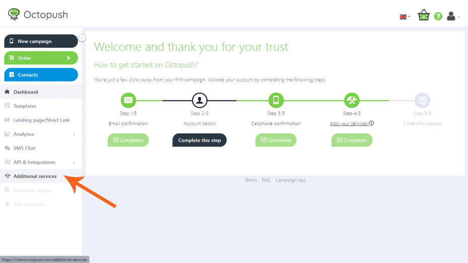
1. Go to your client platform and click on “Additional services” on your sidebar.
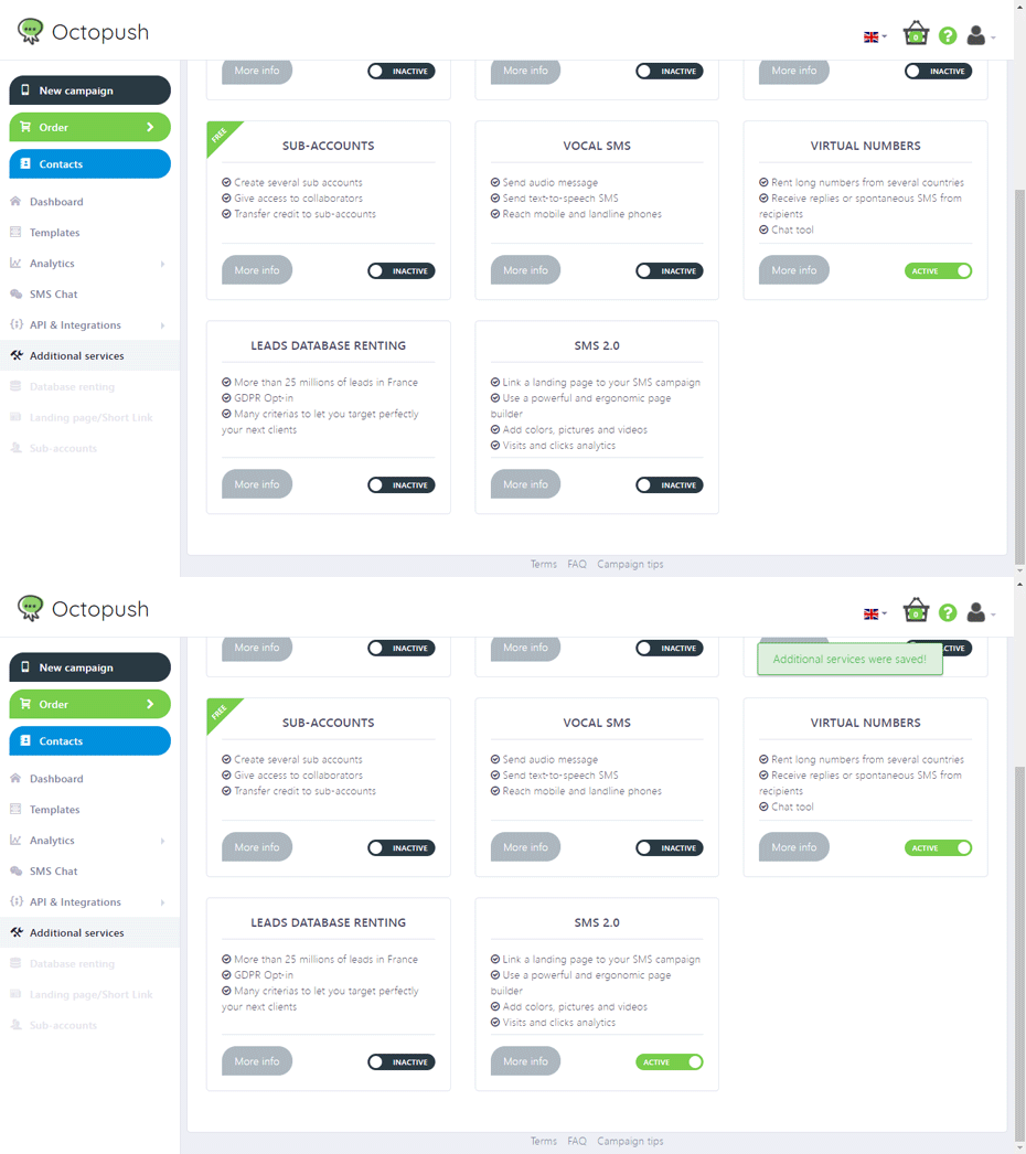
2. Scroll down to find your SMS 2.0 feature and click on INACTIVE.
3. On the same space client’s sidebar, go to Landing page/Short link.
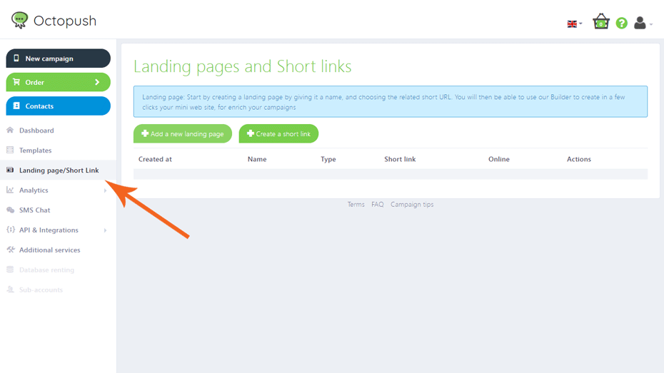
4. Fill out the fields with your information and click on SAVE.
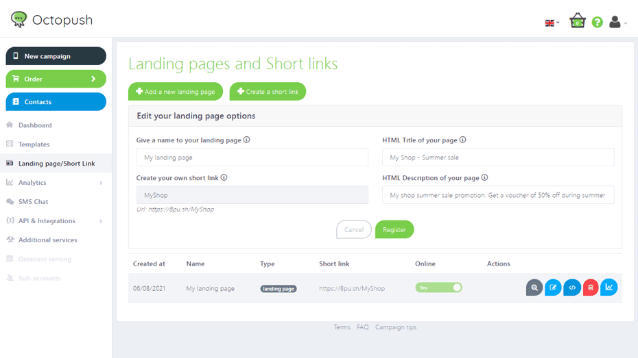
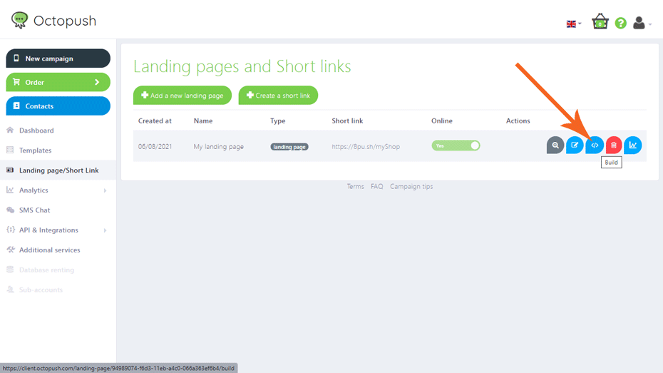
5. You have successfully created a mini website! Now it’s time to work on the design. On the action’s column, select BUILD.
If you’re looking to create mobile landing pages for your SMS marketing campaign, this blog post should have given you some useful tips to get started. You’ll want a mobile landing page that’s optimised with the right keywords and equipped with social proof from customers or testimonials from former customers.
With these qualities in place, it’s easy to see why creating mobile landing pages with a drag & drop tool can be so effective in generating conversions and sales – all without requiring any extra effort.
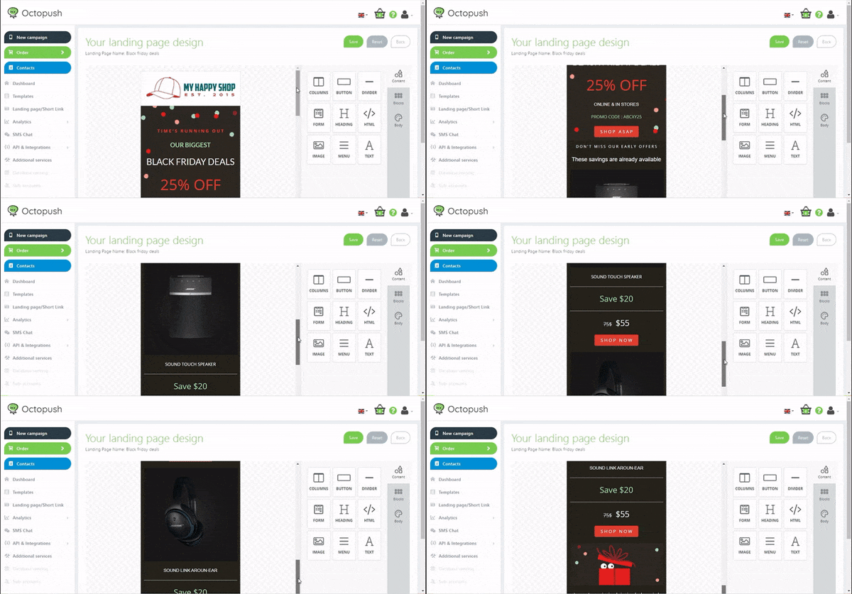
If you’re interested in great mobile landing pages but don’t know where to start, follow these instructions and in no time, you will master the creation of pages with our web builder.
Let us help you make an impact by giving your business an edge over your competitors with well-optimised mobile landing page examples.


